The promise of a restaurant ordering app is speed. A guest who opens your app instead of waiting in line is betting it’ll be faster. When it isn’t, they don’t complain. They just go back to the line, or to a competitor.
At Jack in the Box, nothing in the ordering flow was dramatically broken. It had simply accumulated friction the way most digital products do: incrementally, invisibly, and with good intentions. When we mapped the full flow from opening the app to completed checkout and measured where the time went, the problem was clear. Then we cut ordering time in half.
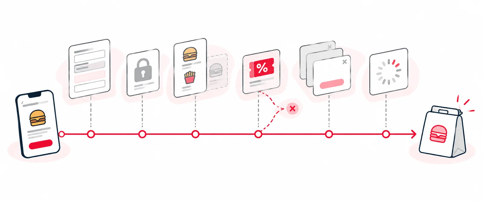
These are the places restaurant apps lose guests, in the order guests hit them.
1. Sign-up asks for too much, too early
Every field in a sign-up form is a small tax. Ours asked for a birthday, to personalize offers, and a zip code, to localize content. Each made sense in a meeting. Neither was worth what it cost before a guest had placed a single order.
The test we used: does this field unlock something meaningful for the guest right now? Birthday and zip code didn’t pass, so they came out. Account creation got shorter, and fewer people dropped off.
2. Signing in is a wall
Passwords are a terrible fit for an app people use for 90 seconds at a time. Forget it once and you’ve lost the order. At Jack in the Box, password resets were the single most common reason guests contacted support.
We replaced passwords with one-tap magic links. Sign-in success went to the mid-90s and support contacts dropped 26% (case study).
3. The menu hides what sells
Guests don’t browse a restaurant app the way they browse a store. Most are on a direct path to checkout. Anything not on that path might as well not exist.
At Jack in the Box, the “Munchies Under $4” category converted well when guests saw it, but it sat where they’d only find it by browsing. In a restaurant, that’s the snacks by the register. In the app, it was in the back. Moving it up the hierarchy, with no new feature and no redesign, added about $11,000 in sales a day, roughly $4MM a year (case study).
The question to ask: which categories convert well when seen, but aren’t seen much? That gap is revenue.
4. Offers pull guests out of the order
If using a deal means adding the offer and then hunting the menu for the item it applies to, guests either skip the deal or get the combination wrong. We put the eligible products right on the offer detail page, and choosing one adds the offer and the product to the order together in one step, and more guests redeemed offers and finished their orders. I wrote about offer redemption in depth in Why restaurant app offers fail at redemption.
5. Every tap opens a new screen
Product details, customization and bag editing each pushed guests onto a new screen, and every back button was a chance to lose the thread. We moved those interactions inline or into overlays, so guests could adjust an item without leaving where they were. Back-navigation in the main ordering path became almost nonexistent.
The principle: once a guest starts ordering, the only direction should be forward.
6. The app is slow underneath
A clean design still feels slow if the menu, cart and store location take a beat to load at every step. Guests feel latency even when they can’t name it. We treated API speed as a product requirement, in the same conversation as button placement, and brought response times down at the moments that mattered.
Loading animations don’t fix this. They make waiting prettier.
7. Checkout fails at the last step
The most expensive failure is the one at the end: a guest who has built an order, chosen a pickup time and tried to pay, and then lost it. That was one of the four biggest complaint categories in our app reviews. Checkout was rebuilt to be resilient, and the order losses that had been driving one-star reviews stopped.
How much faster ordering got
No single change produced the result. Together, they cut end-to-end ordering time by 50%, with more guests redeeming offers and finishing their orders (case study).
How to find your own friction
- Order from a brand-new account, on a phone, on cellular. Time it. Count every field, tap and screen.
- Ask who each step serves. If the answer is only the business, it’s a candidate to cut.
- Read your one-star reviews and sort them by where the order broke. (Here’s how.)
- Measure the funnel step by step, from app open to completed order, and fix the biggest drop first.
The fastest step is the one that doesn’t exist. Most restaurant apps don’t need new features to sell more. They need fewer obstacles between a hungry guest and the pay button.